How to set up an attractive donor wall
As your organization grows, you’ll realize that your organization’s facility serves countless purposes beyond simply giving your staff a place to work—it supports your development efforts as you offer tours to major donors, serves as the backdrop for many of your promotional photos, and may even be the venue for your organization’s key events. As the foot traffic in your office increases and the need for improved aesthetic appeal grows, your leadership team may begin preparing to take on the project of installing a donor recognition wall. Here are the major considerations your team should keep in mind as you plan the display:
The budget for your project
In the nonprofit industry, the rule of thumb for donor recognition is that about 1% of your fundraising revenue should be reserved for properly thanking your supporters. Remember, your donor wall shouldn’t use that full 1% allocation, because not all donors will give at a high enough level to make it on the wall. Additionally, every contributor deserves timely recognition, and a donor wall will take much longer to create than the three or so days the US Postal Service requires to mail a thank you card.
Before you start planning the design, location, and components of your donor wall, you should meet with your chosen vendor to discuss your needs and get an idea of the costs associated with executing your project. Here at Friedman Fine Art, we like to schedule our initial meeting with a new client several months before their desired installation date.
The best location for the display
As your team decides where to install the recognition wall, we recommend you map out the regular flow of your space. Where does the most traffic come through? If it’s in a particular hallway or room, what walls do people see immediately as they walk into the space? Are there any places on the walls which are typically covered up by projector screens, open doors, or anything else?
Above all, recognize the way you interact with major donors and sponsors when they visit your facility. Are there specific paths you take in every tour you give? Are there rooms you don’t really take them through, such as the intern’s office or break room? The purpose of the donor wall is to show appreciation for your biggest givers, so make sure it’s located in a place they can’t miss.
The people you include
Who qualifies as a “major donor” in your organization? In the nonprofit world, this term generally refers to those who make up the top 10% of your individual donors. However, the practical definition of a major donor may be different for your organization, and you want to be sure you properly recognize everyone who provides extraordinary support. We recommend you work closely with your donor wall vendor to decide a rough figure of how many people you should initially recognize in your display based on the square footage and budget you have available, and work from that number to decide the cut-off on who will be recognized.
The look and functionality of your wall
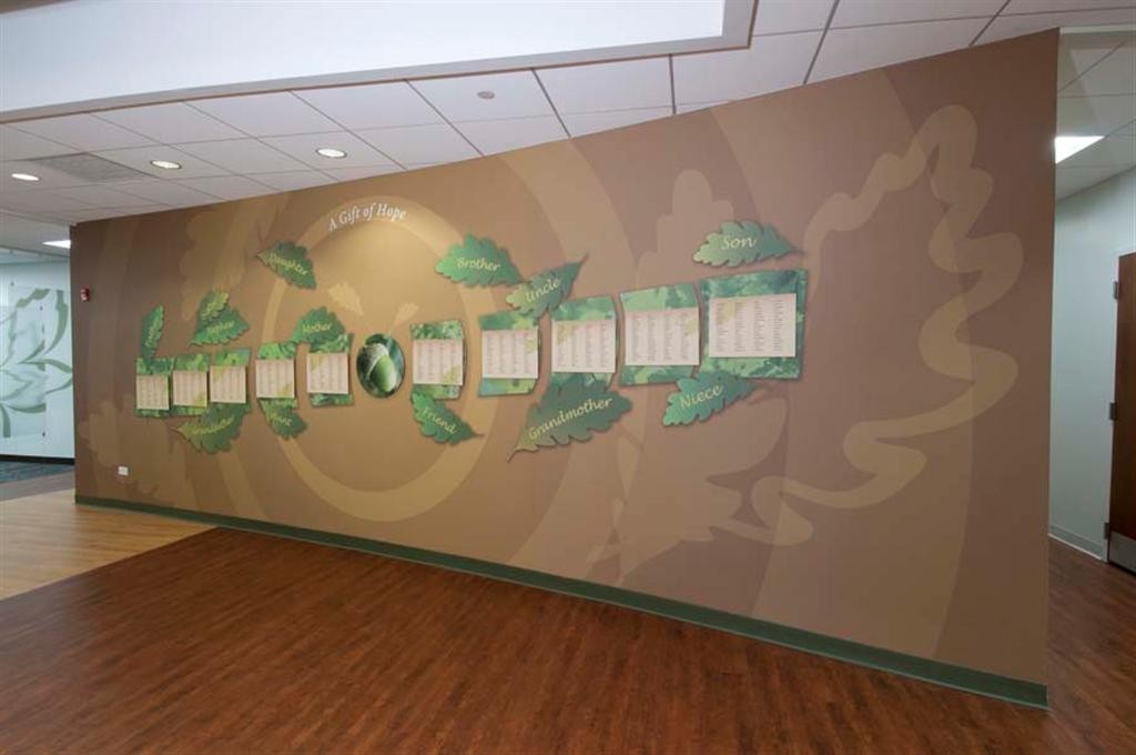
Your donor wall should help tell the story of your organization. You want it to stand out from the rest of your decor without looking completely out of place. The mission, cause area, and overall marketing strategy of your organization can help guide your recognition wall’s design. For example, Gift of Hope uses lots of earthy green colors and images of trees in their marketing pieces, so the donor wall we designed for them included coordinating colors and leaf graphics.

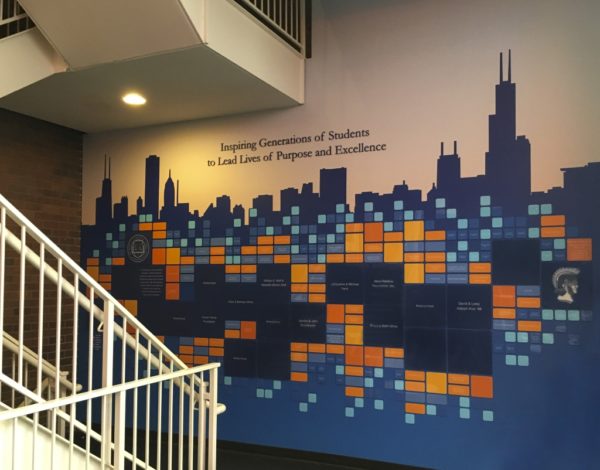
In the display we designed for Latin School of Chicago, we incorporated their blue and orange color scheme into a silhouette of Chicago’s skyline that is used throughout their marketing and branding programs.

painted dimensional letters and the special feature of being added to for years to come
The aesthetic appeal of the donor wall isn’t the only design element to consider. Your wall may eventually need to include new names; if this is the case in your organization, the design should allow for future additions without looking like there’s an awkward amount of blank white space. For example, the wall we designed for the library at DePaul University includes plenty of space for new names, but the blank spaces look planned and artistic.

Another design aspect to examine is whether you want to recognize gift categories, or distinguish different donor levels with various font sizes. As you grow, you may appreciate the flexibility to change the qualifications you use to decide which donors will be recognized on the wall. Sometimes including a color key is an effective method of displaying the different levels of contribution.
One last tip…
This may seem obvious, but it’s extremely important to double check your spellings! Even though your individual donor plates will probably be easy to re-order in the case of a typo, it’s extremely embarrassing to reveal a donor wall with misspellings. Have several people carefully look over your list of donor names—and preferably, people who don’t work in your Development Department. Your development officers look at donors’ names every day, and it can be beneficial to use a set of fresh eyes.
Where to go from here
At Friedman Fine Art, the donor wall design process is extremely collaborative between our team and yours. Schedule a consultation with our president, Loren Friedman to start planning your donor wall display. Using the information we gather about your organization’s marketing strategy in our first consultation, we’ll create several design options and ask for your feedback. Once a design is chosen, our team will incorporate the content you would like to include, such as your donor names, logos and insignias, mission statement, and any other statements you would like to include. After we receive your final approval on the completed design, we’ll fabricate and install your new graphic display.
