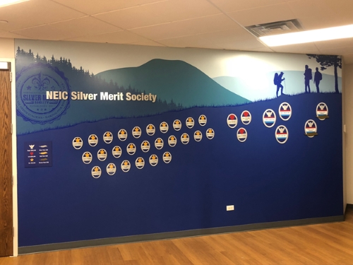
 This month, we tackled a new, unique challenge and wanted to share the results with you! We were recently approached by the Northeastern Illinois Council (NEIC) of the Boy Scouts of America to create a donor wall for the reception area of their headquarters building in Vernon Hills, Illinois. Many organizations ask us to design ‘open’ donor walls, which allow extra space in the display for additional donor plaques to be added in the future as the organization secures new contributors. Boy Scouts of America asked us to take the open donor wall concept to a new level by designing plaques which could be moved across the wall as their donors contribute additional funds over time. For example, if a donor started out contributing at the $25,000 level, and then increased their donations to $250,000 or more, the plaque would move to different areas of the wall denoting larger donation levels.
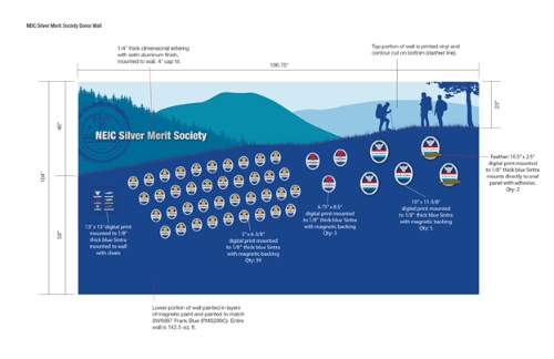
We worked with our fabricators to research and prototype various solutions to this design challenge, and ended up creating a wall that answered all of the Boy Scouts of America requirements. We printed the top portion of the wall on a seamless vinyl wall covering, which we use in most of our donor wall designs. Then we covered the bottom portion of the wall with four coats of magnetic paint so we could hang magnetic, moveable plaques on the wall. To create a strong enough magnetic surface for the plaques, we applied the paint using traditional rollers and a putty knife.
Whenever we design a donor wall for a client, we always take care of the fabrication and installation of the display to ensure the presentation looks professional and flawless. In some cases, we use a template to help us line up the plaques evenly across the wall. At the end of this project, we gave this template to the Boy Scouts of America so they will be able to keep the design consistent as they adjust the name plates over time.
While we really enjoyed the problem solving aspect of this recent donor wall project, one of our favorite parts of every project is personalizing the display to the organization we are working with. As we started conceptualizing this design, we planned to incorporate an image of Boy Scouts camping in the wilderness. When we brought this idea to the NEIC, they liked the suggestion and asked if we could use a mountain owned by the Boy Scouts as the backdrop for the image. We added the image of the Boy Scouts to the graphic representation of the mountain owned by the organization. We also incorporated the Boy Scouts of America brand standards, such as their preferred colors, symbols, and fonts, into the design.
 The new NEIC donor wall serves not only as a permanent fixture of thanks to Boy Scouts donors, but also adds a new layer of richness and depth to the interior design of the organization’s headquarters. If your educational institution, health organization, or other nonprofit agency is ready to add a donor wall to your facility, contact Friedman Fine Art to get started. You can also see some of our previous donor wall and donor recognition display projects for inspiration.
